
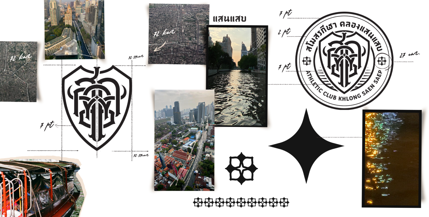
our concept design It comes from Thai text, brought together by overlap technique.
through efforts to produce the result as a bridge,
a buffalo, a spark from the river, a canal
middle of the logo There will be a long space to the bridge arch. and coexist with the sparkling light of the river The curved part comes out both left and right. It conveys the movement of the river and also looks very close to the "Thai buffalo" behind the rice that we eat every day.
The main inspiration comes from what comes from the community. What we want to communicate is the use of Thai language. Create a logo that expresses Thainess. and complete in the story of the community as much as possible
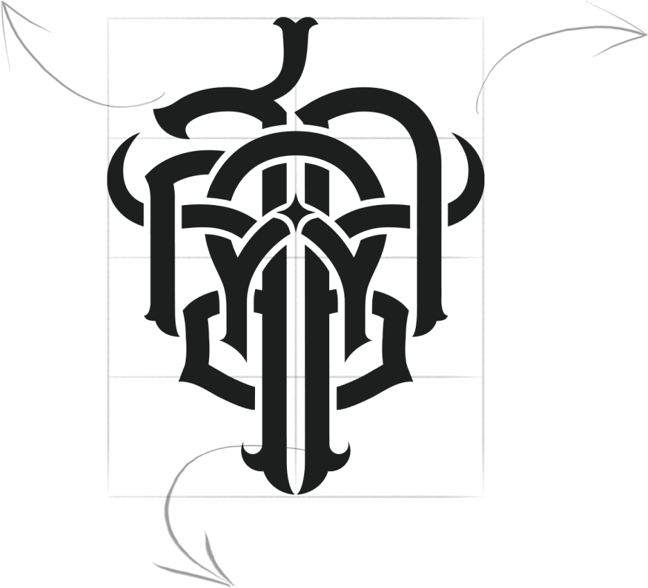
the top end of the logo It is a lotus flower that sits on the Saen Saeb canal for 72 kilometers of us. The lotus flower in Thai proverbs It also conveys the good that floats above the bad.

This is the best reflection of water. Because we designed it to be read on both sides. even reflected in the water
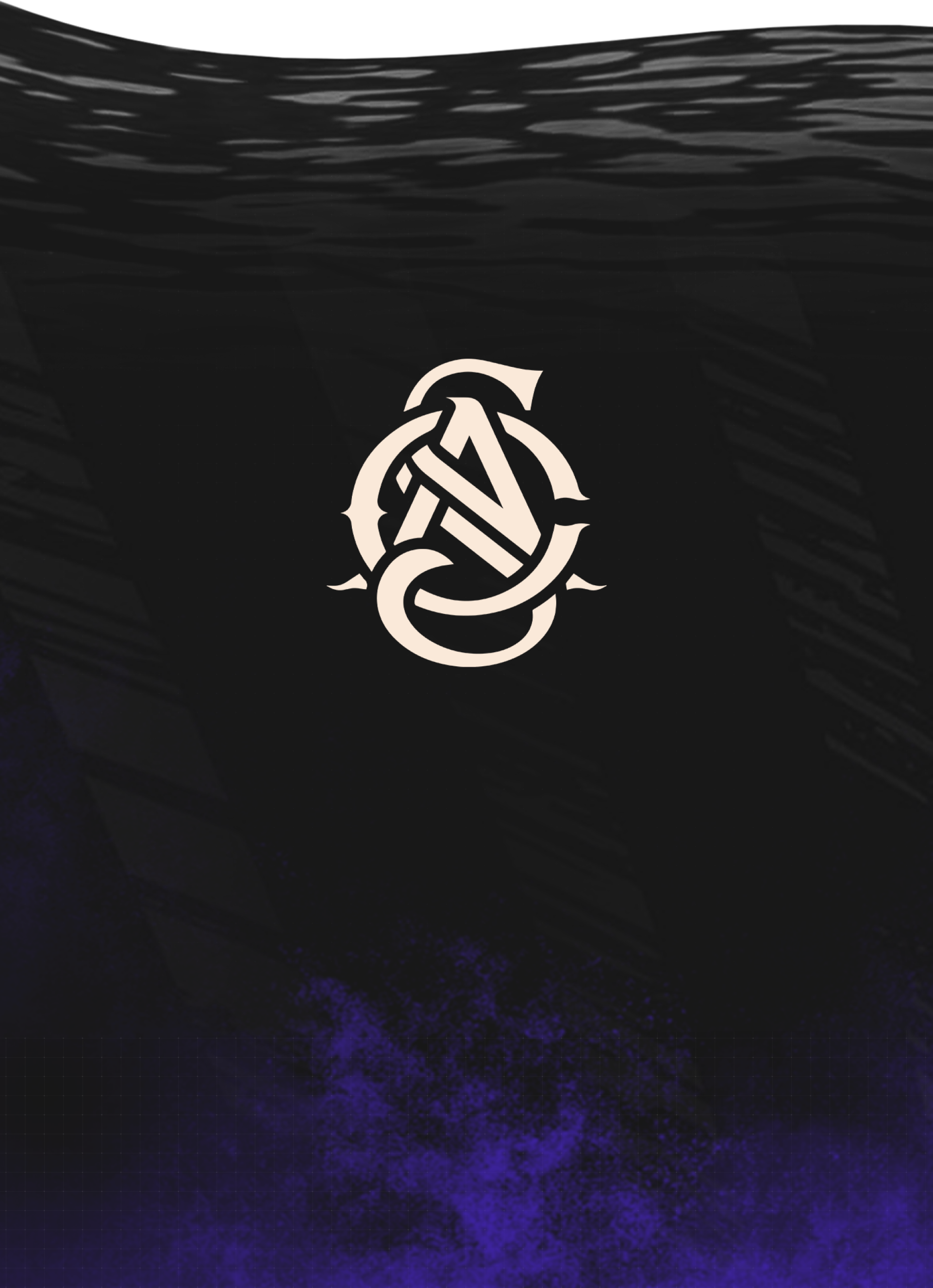
And this is our e-sports version of the logo. It is designed for use in all tournaments. both in Thailand and globally
Designed with a modern classic concept. The text overlay technique is similar to the classic logo (Thai language). The logo is contemporary and can communicate with the world. as desired